TLDR
- Your page is the product experience, not a description of it
- Shop competitors before rewriting anything
- Specific copy, contextual images, and honest reviews move buyers more than design
- Objection handlers belong near the buy button, not the footer
For most buyers, your product page is your product. They will never hold it, try it, or smell it before deciding whether to hand over money. Whatever you put on that page is the entire experience — and it will be judged with the same standard they would apply to the physical thing. Would you ship a product that was not finished, had not been photographed properly, and came with instructions written by someone who had never used it? The product page gets that treatment constantly, from stores that would never cut those corners on the product itself.
Getting it right is not a design problem or a copywriting problem. It is a readiness problem. Your product page needs to be as ready to face a customer as the product it is selling.
What does your product page actually answer?
A buyer landing on your product page is running through three questions whether they realize it or not: does this do what I need, do I trust this seller, and is the price worth it. If your page does not answer all three clearly and quickly, the sale does not happen — and you will not get a reason why.
Most merchants optimize for the first question and neglect the other two. The copy explains what the product is. The images show what it looks like. But trust and value justification get left to a 4.8 star rating and a footer link to the returns policy.
Shop your competitors before you rewrite anything
Open five stores in your category and spend thirty minutes buying nothing. Browse the way a real customer would — skeptically, quickly, with a tab open to a competitor the whole time.
The stores converting well tend to be doing similar things. The ones that are not are usually missing the same things in the same order, as if there is a shared template for a mediocre product page and half the industry downloaded it. Pay attention to how they handle the questions buyers always have: does this fit, what does it actually look like in real life, what happens if it is wrong. That thirty minutes will tell you more about your own page than a month of staring at your analytics dashboard hoping it develops a personality.
Is your copy describing the product or helping someone picture owning it?
Most product descriptions explain what the product is, which is not the job. The job is to help someone picture having it — using it, wearing it, installing it, solving the problem they came to solve.
Powerful and flexible means nothing to someone deciding whether to spend $80. Works with any Shopify theme, no code required means something. Specific beats impressive. Write for the person who is already interested but not yet sold — they do not need an introduction, they need the one detail that tips them over.
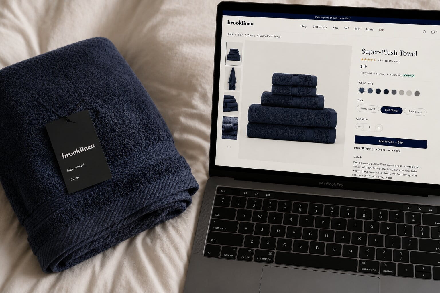
Do your images actually show the product?
A buyer cannot touch the product, so your images are the closest thing to handing it to them. Showing it on a white background is a starting point, not a strategy. Show it in use. Show scale — next to something familiar. Show the detail someone would check in person: the stitching, the finish, the way it opens, the size of the ports.
If your product solves a problem, show the before. If it has a learning curve, show someone using it correctly. Video helps more than most merchants expect — even fifteen seconds of someone actually using the product answers questions people are too passive to type into a search bar.
Are your reviews doing any work?
A 4.8 average with forty reviews that say great product, fast shipping proves nothing to a hesitant buyer. That is background noise wearing a badge.
What moves someone is a review like: I had tried two similar products and returned both — kept this one. Specific, from someone who doubted it first. Surface your most useful reviews near the buy button rather than burying them below the fold. And change how you ask for them: instead of leave a review, ask customers what made them decide to keep it. You will get very different answers.
Where are your objection handlers living?
Returns policy. Shipping time. Warranty. Who made this and why. Merchants consistently put these in the footer, between the sitemap and the cookie policy, where no one making a buying decision will ever find them in time. Buyers look for this information right before they commit, not after.
If your return window is generous, say so on the product page. If you ship within 24 hours, say that too. These are not legal disclosures — they are the last things standing between a hesitant buyer and a completed order, and they belong somewhere a hesitant buyer will actually see them.
One fix to make this week
Open your best-selling product page, spend ten minutes shopping two competitors in your category, and come back with one question: what are they answering that you are not. That gap is where your next sale is hiding.